Work/UX/UI/№03
UX/UI
TheGuarantors
Optimizing the renters insurance funnel
Turned a long, jargon-heavy insurance application into a two-minute, high-converting quote flow.
- Role
- Senior UX/UI Designer (UX Architecture & User Testing)
- Year
- 2021-2023
- Team
- Product · Engineering · QA
- Stack
- Figma · Miro · Maze · Dovetail
Problem
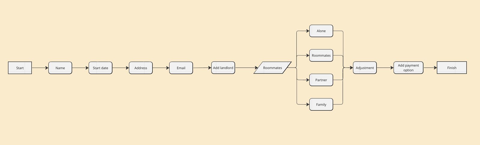
The legacy renters insurance funnel suffered from high abandonment rates due to a long process and complex insurance terminology. The form architecture lacked progressive disclosure, forcing users through an unoptimized flow that led to high decision fatigue.
Additionally, the original funnel operated in isolation, lacking strategic touchpoints to introduce users to relevant cross-sell products within the broader corporate ecosystem.
Approach
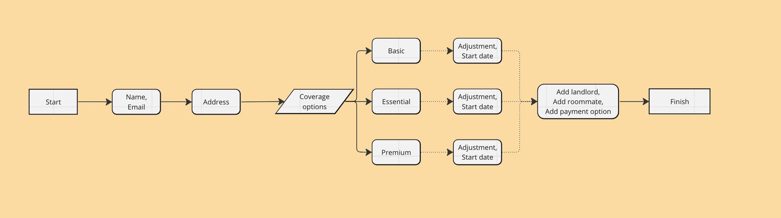
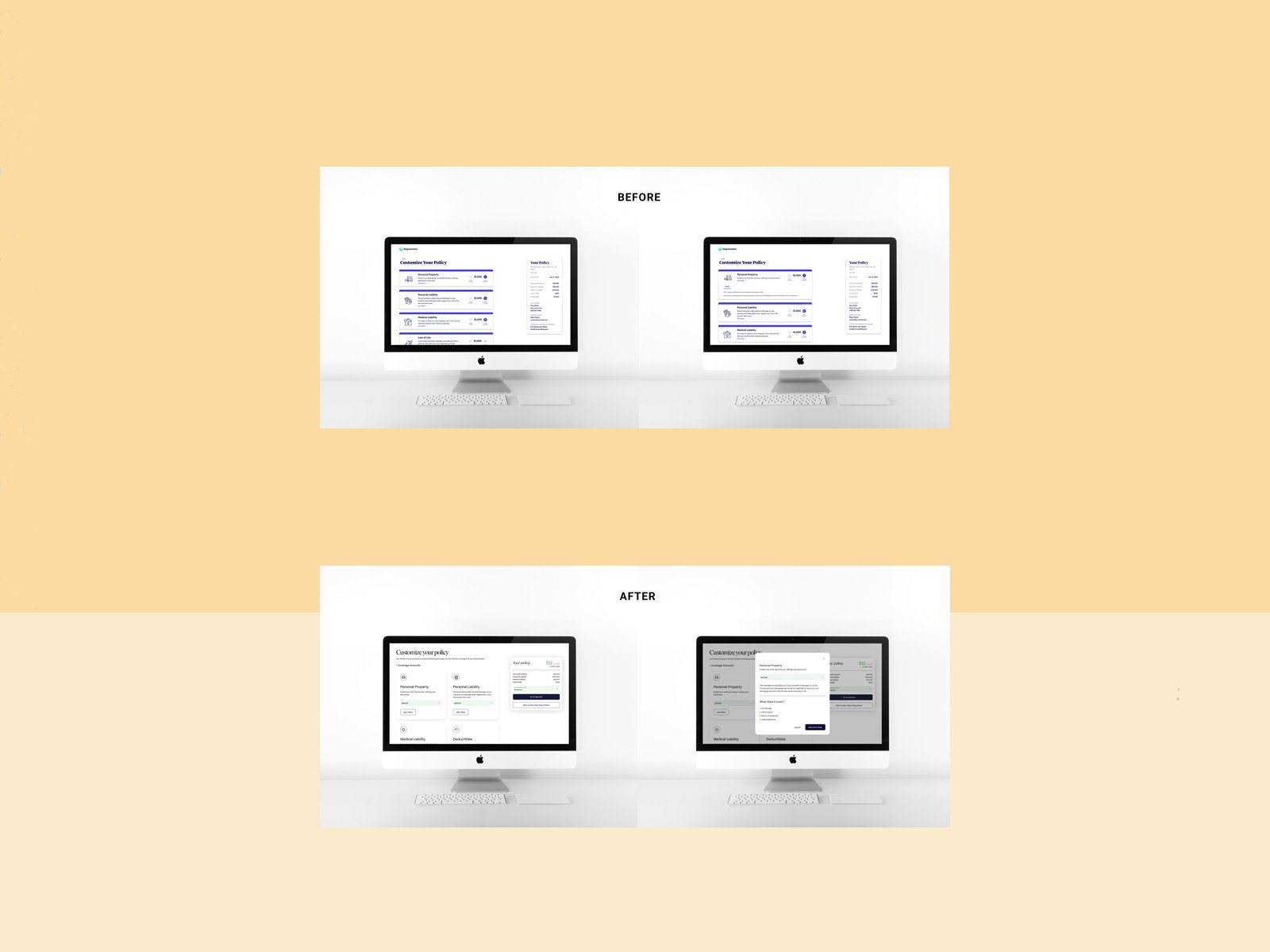
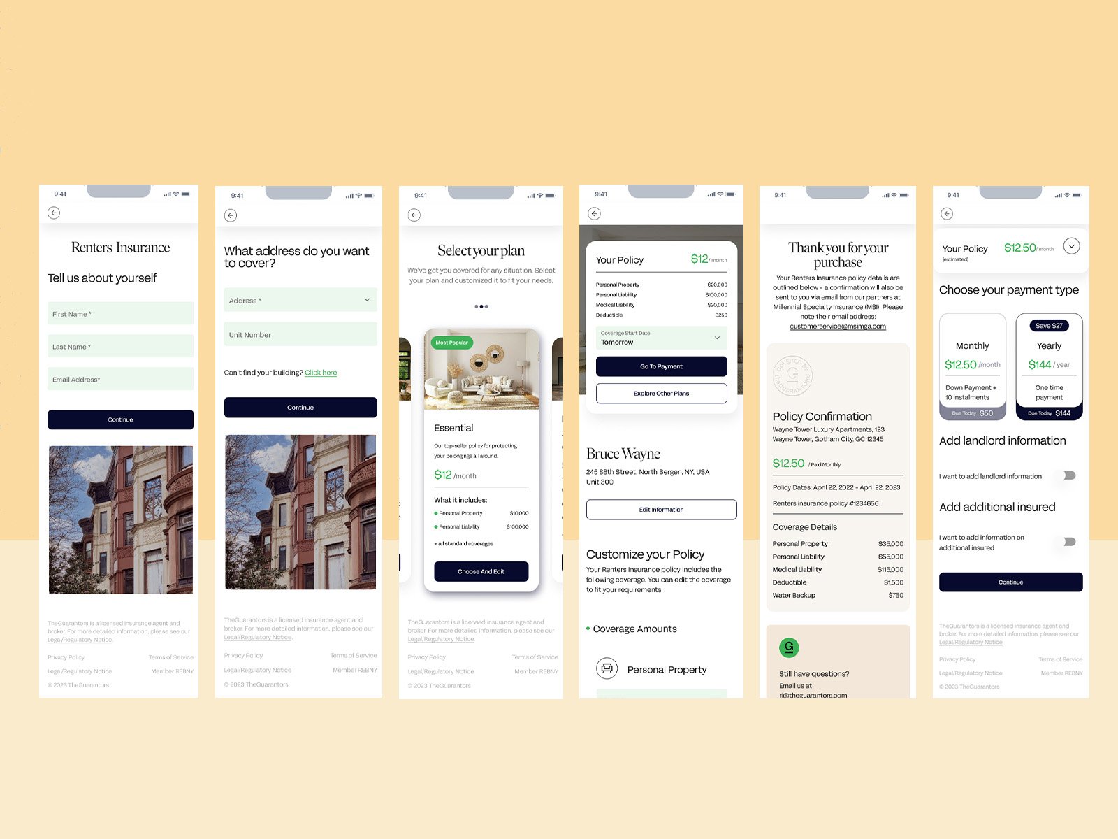
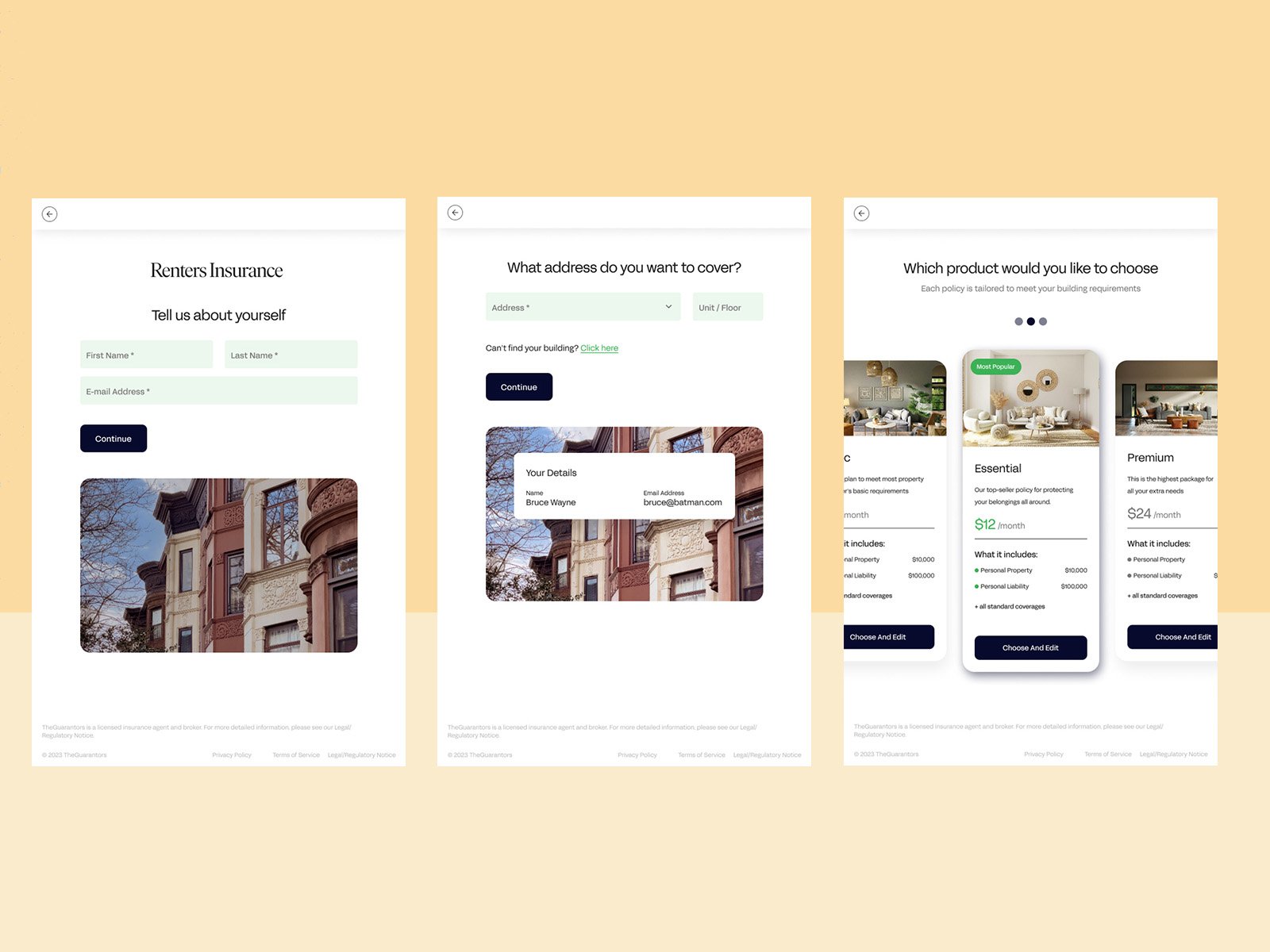
The funnel was overhauled using a template-first model and a dual-path architecture that reduced the time-to-quote to under two minutes. By introducing value-driven landing pages and different packages, the interface streamlins the path to purchase for standard buyers while maintaining a flexible, granular configuration flow for advanced coverage requirements.
01
Upfront pathing architecture
The application flow was decoupled into a dual-path system based on a deliberate entry configuration. I simplified the landing-page choice that funnels users into distinct streams before they encounter complex policy inputs. The express path bundles common coverage levels into_rapid-selection packages, while in the custom path adds the possibility for customization.
02
Quantitative testing & validation pipeline
User behavior and funnel friction were continuously monitored using Maze to track drop-off coordinates and completion speed, and Dovetail to tag qualitative feedback alongside quantitative metrics. This ensured usability updates targeted verified performance bottlenecks rather than subjective design choices.
03
Design ops & decision-point handoff
To keep funnel logic resilient during the enterprise-wide Material Design migration, I isolated every decision point and branching path into its own user flow. These were translated into modular Jira stories that documented each state, responsive screen layout, and micro-copy validation rule, letting developers implement the responsive logic step by step.
Process
Artifacts from the room.
Outcome
Streamlining the application flow and applying progressive disclosure removed the primary friction points. This yielded a 40% reduction in user drop-off.
Integrating automated cross-selling touchpoints into the decision-point architecture drove a 25% increase in total journey initiation across secondary product categories.
The responsive, Material UI based design patterns established a standardized blueprint that can be replicated across future corporate insurance products without modifying the core codebase architecture.
40%
Reduction in user drop-off
25%
Increase in secondary product journey initiation
<2 min
Average time to get a quote
2
Modular paths: Express and Custom
Next