Strategic Problem
High-stress users (couples) were overwhelmed by the complexity of manual music booking, leading to significant abandonment and operational overhead. The reliance on a simple contact form caused critical logistical failures, including frequent double-bookings and delayed confirmation cycles that eroded customer trust.
Systemic Solution
I engineered a hand-holding booking engine that guides users through singers, ceremony music, and reception packages with real-time feedback. This solution utilizes integrated calendar logic on both the client and provider sides to automate callback scheduling, final confirmations, and payment deadlines.
Methodology
I conducted a competitive market audit of high-end event services and utilized storyboarding to map emotional stress points in the user journey. Through iterative low- and high-fidelity prototyping, I validated interaction patterns that balanced complex package customization with simple, linear navigation.
Design Strategy
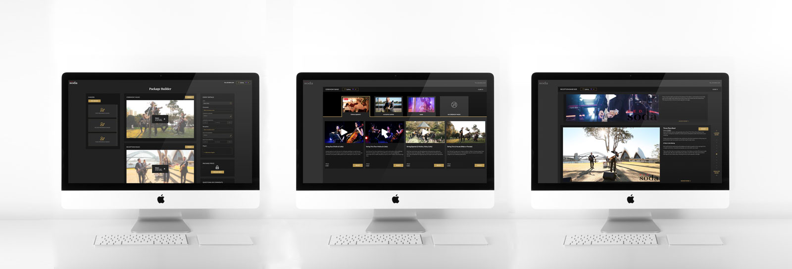
I implemented a persistent budget sidebar that updates dynamically as users select musicians and packages, ensuring financial transparency throughout the flow. To drive sensory-based decision-making, I integrated sample videos for every musical option, allowing couples to audition talent directly within the booking funnel.

Stakeholder Management
I collaborated closely with the RedSoda leadership and development teams to translate artistic musical packages into rigid digital logic. I acted as a strategic consultant, using stakeholder feedback to strip away non-essential steps and deliver the simplest possible interface for a high-stress environment.
Design Ops
I established a modular UI framework that supports variable inputs—such as musician sliders for reception bands—allowing RedSoda to add or modify talent rosters without requiring new design sprints. This design language ensures the system can scale from small intimate ceremonies to large-scale corporate events.
Reflection
This project proved that for high-ticket emotional purchases, the UX must act as a Concierge. I learned that providing budget clarity and auditory previews directly in the funnel is the most effective way to turn a stressed visitor into a confident, paying customer.
Final outcome
For the outcome, I have been in constant contact with RedSoda. Their feedback on the mockups helped me to make the system as simple as possible.
Booking system
There are 3 main music aspects of a wedding, singers, ceremony music and reception music. The booking system guides the customer through each step, one by one. It is possible to choose 3 options for the singer, making sure that one would be available on the big day. For the reception music, one can use a slider to decide on the number of musicians to make sure customers stay within their budget.
Each option is a sample video, so couples can listen to it, making sure it is the right fit.


