Business Impact
Successfully achieved a 40% reduction in churn and a 25% increase in acquisition through cross-sell integration.
Successfully achieved a 40% reduction in churn and a 25% increase in acquisition through cross-sell integration.
TheGuarantors
Increasing conversion through funnel optimization and cross-sell integration.
Miro, Figma, Maze and Dovetail
Senior UX/UI Designer - User testing
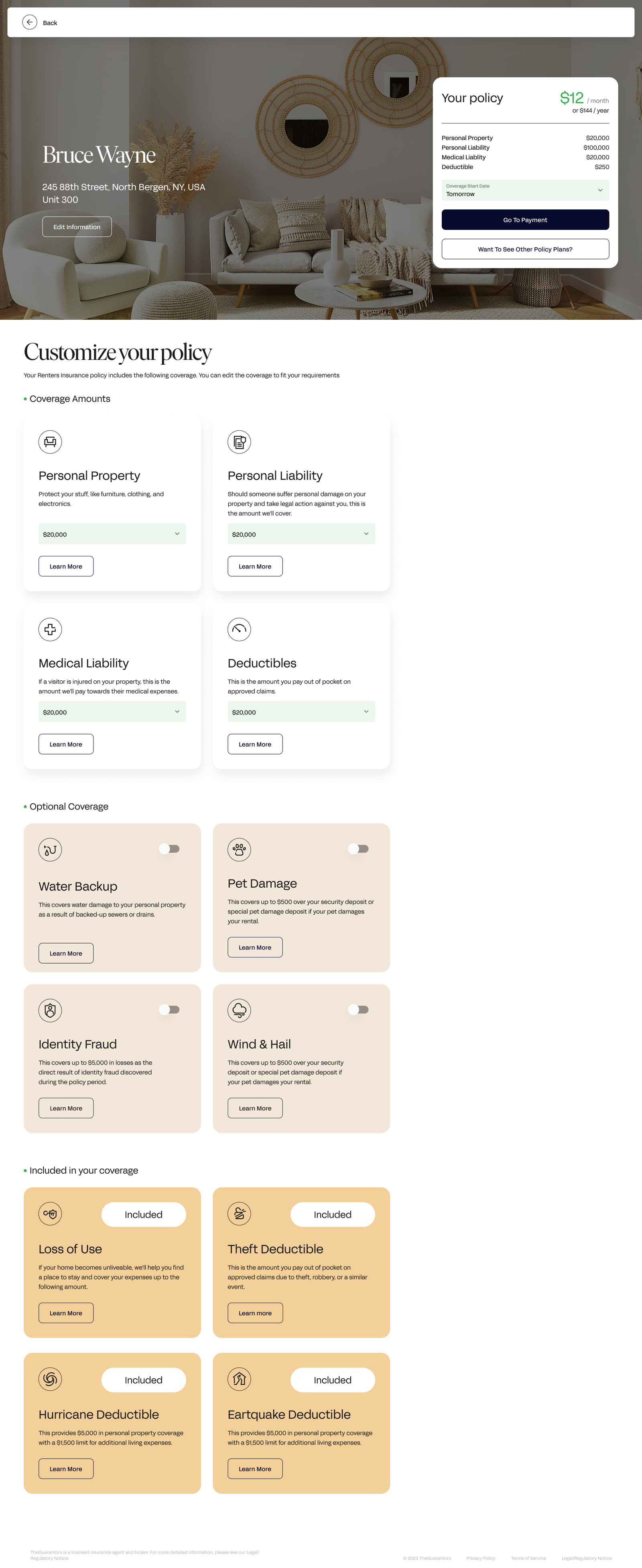
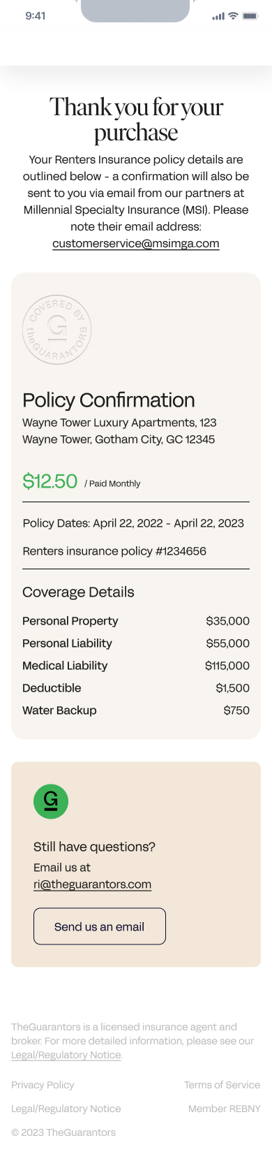
I directed the transformation of a high-friction legacy application into a high-performance conversion ecosystem, achieving a 40% reduction in churn. By implementing Progressive Disclosure and a template first journey, I reduced cognitive load and simplified the path to purchase to under two minutes.
I identified significant churn within the legacy insurance funnel caused by high cognitive load and confusing terminology, resulting in high abandonment rates. The previous journey lacked cross-selling integration, meaning potential customers were often unaware of the full product ecosystem.
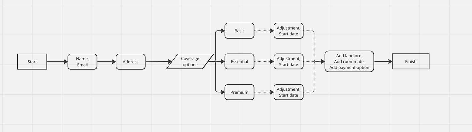
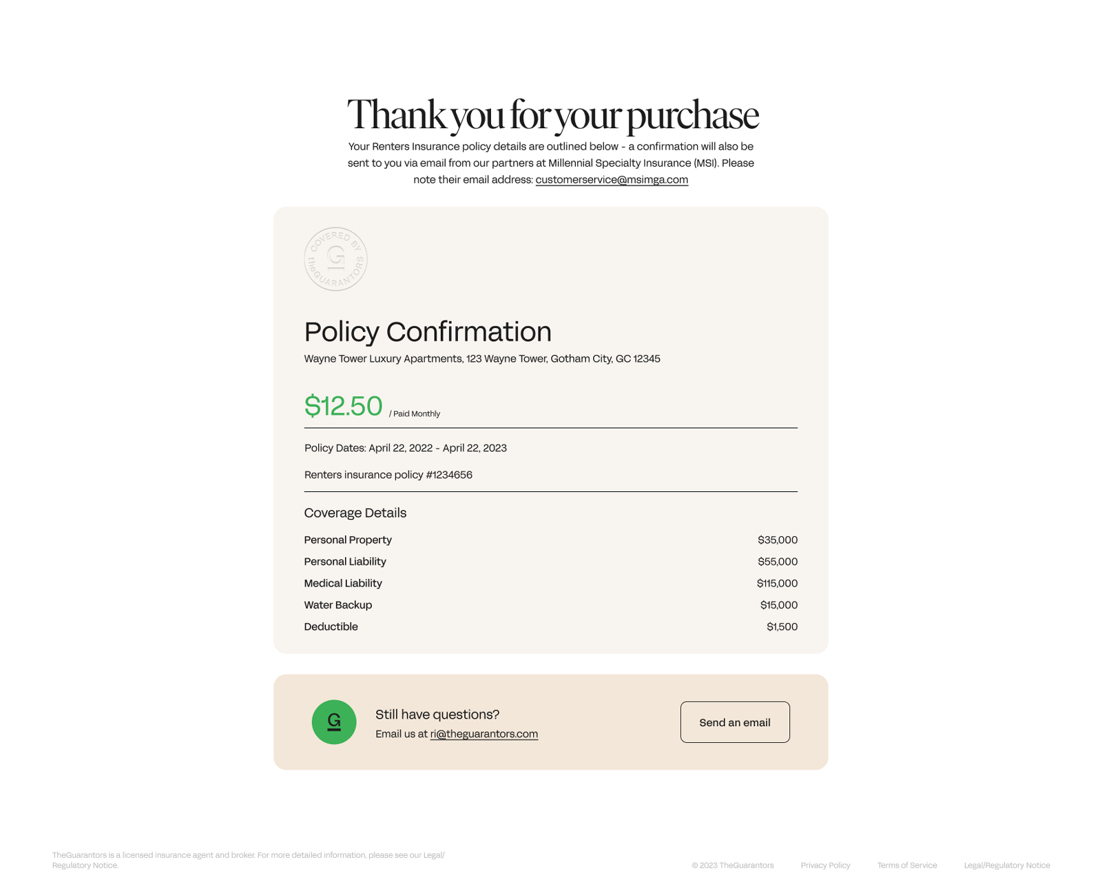
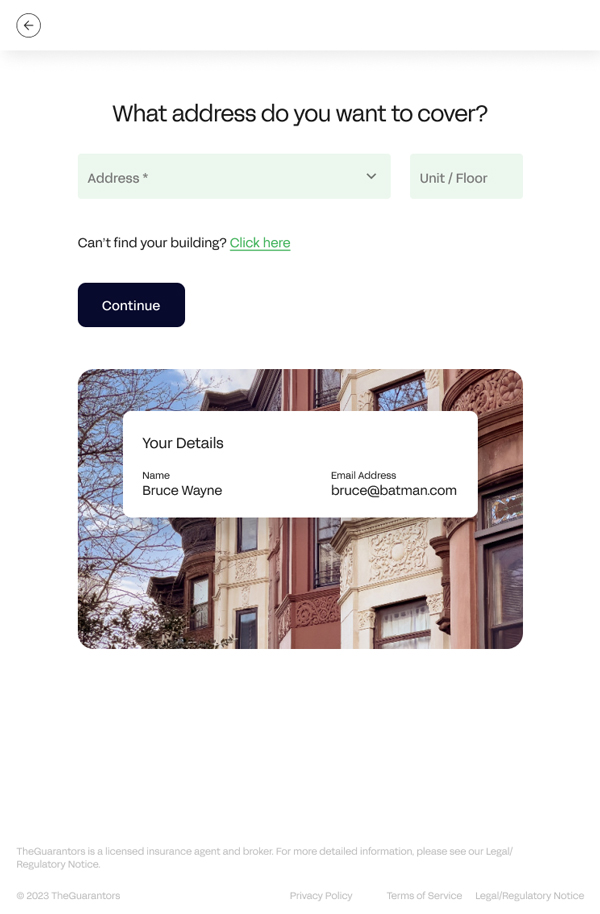
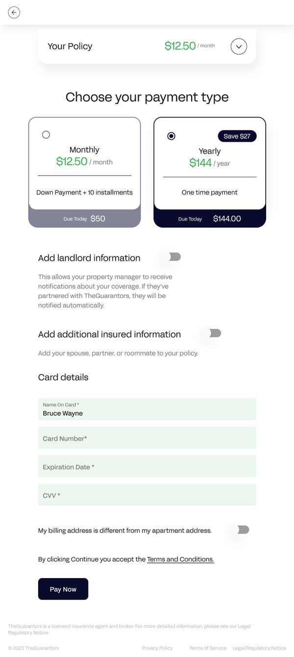
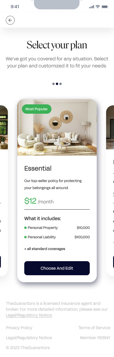
I directed the transformation of the application into a high-performance ecosystem, implementing Progressive Disclosure to manage complex data. This shift created a streamlined journey that allows for policy completion in under two minutes while maintaining flexibility for custom needs.
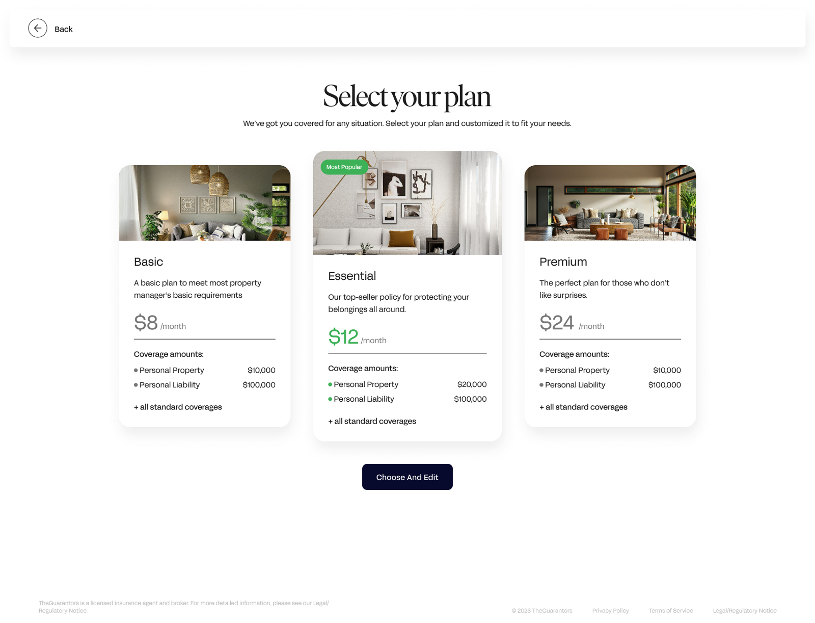
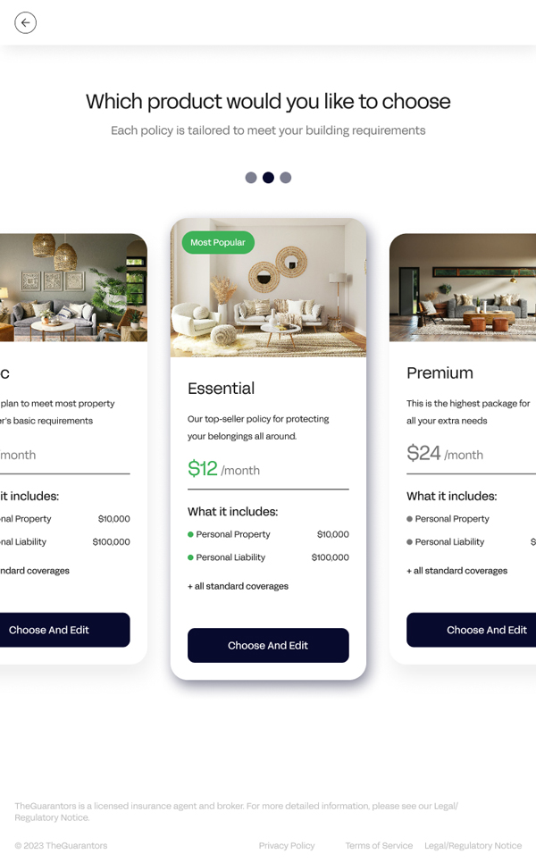
I orchestrated a data-driven redesign by synthesizing qualitative research into modular "Express" and "Custom" paths. This was validated through extensive usability testing using Maze and Dovetail to ensure the new flow mitigated previous friction points.
I utilized a template first model, allowing users to select pre-configured coverage packages to mitigate decision fatigue. This allowed for a faster "Time-to-Quote" while keeping advanced tailoring options available for power users.
I facilitated technical alignment between Product Owners and Engineering, owning the Jira documentation to ensure user stories matched technical feasibility. I acted as the primary bridge between business KPIs and user experience, ensuring a shared vision across the development cycle.
I integrated this flow into the broader Material Design migration, ensuring the insurance module was fully responsive and easily updated. This established a modular design pattern that could be replicated for future insurance products.
This project demonstrated how aligning company goals with UI requirements can pivot a product's performance. I learned that even minimal design systems require rigid governance to ensure a clean, straightforward user journey.
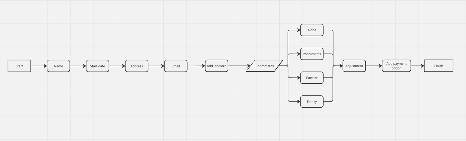
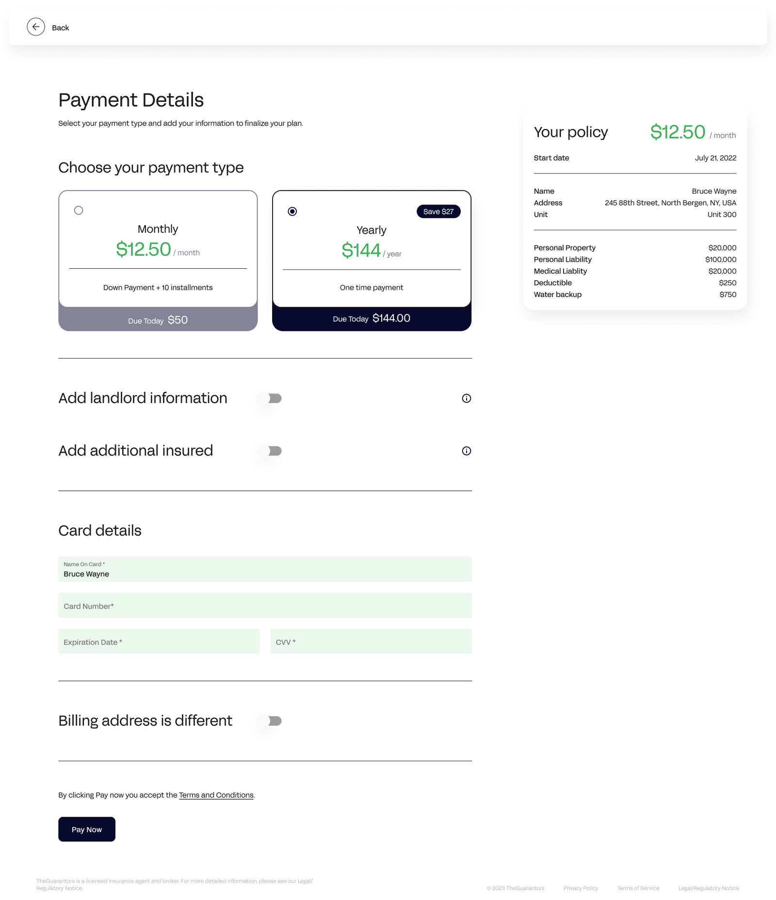
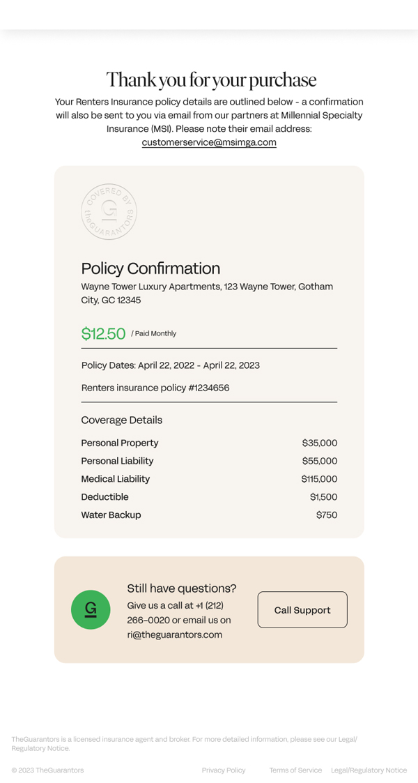
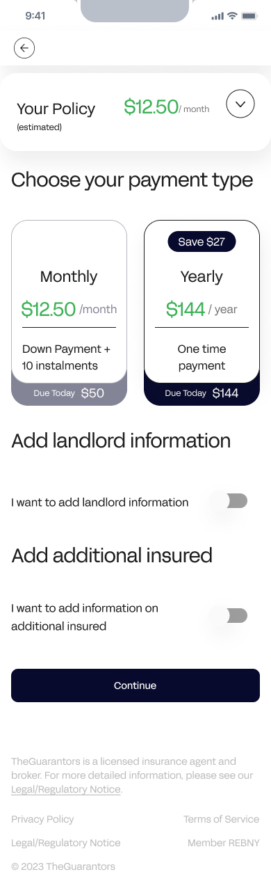
The updated architecture utilizes a modular step-by-step logic. By integrating cross-selling touchpoints for other TheGuarantors products, we increased journey initiation by 25% while maintaining a friction-free core funnel.
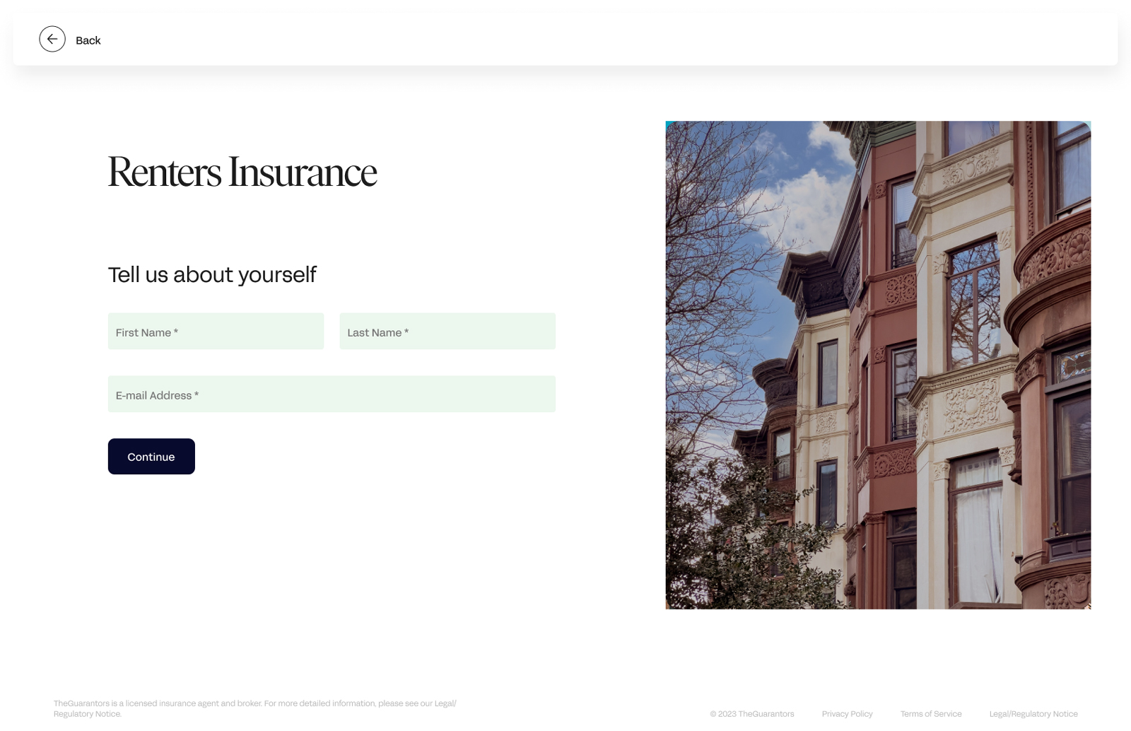
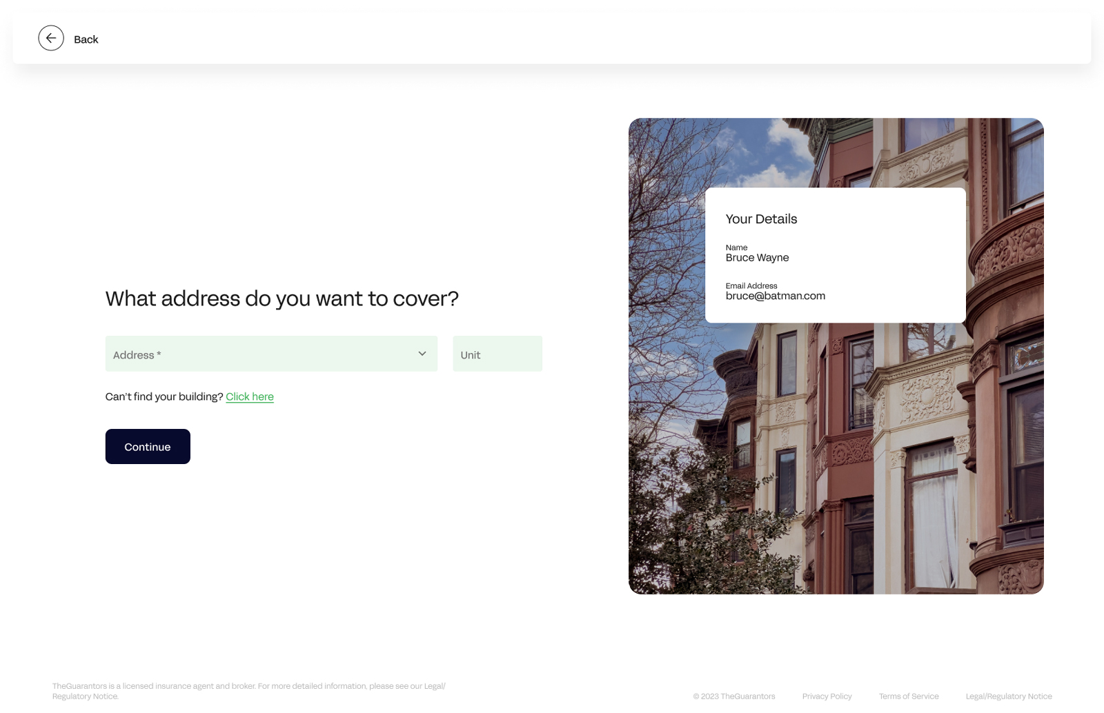
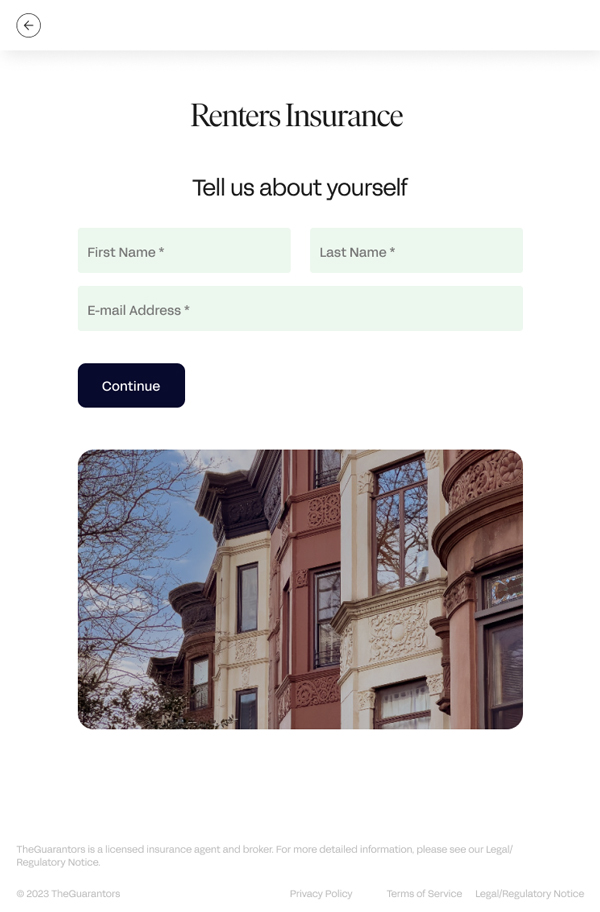
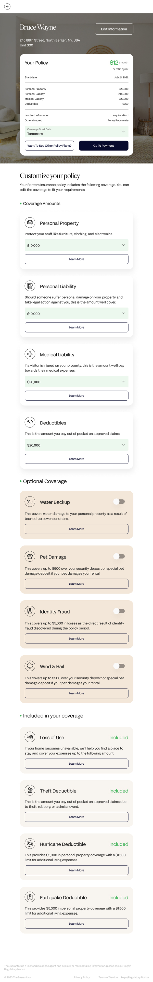

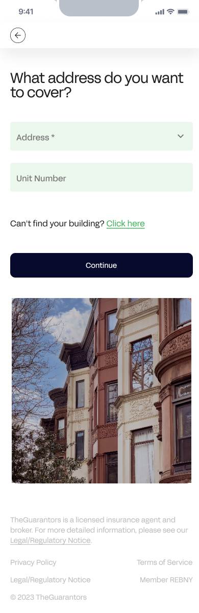

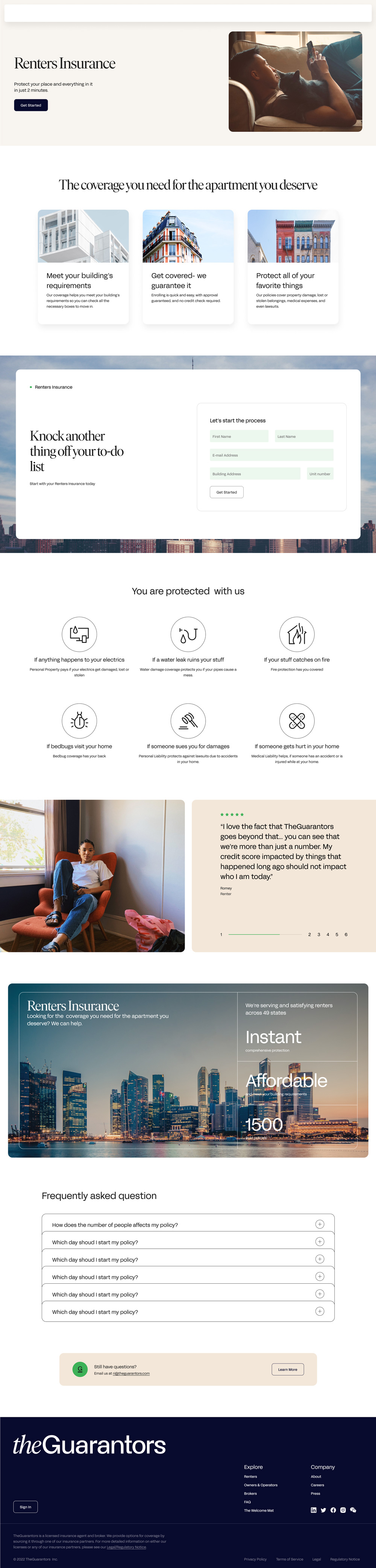
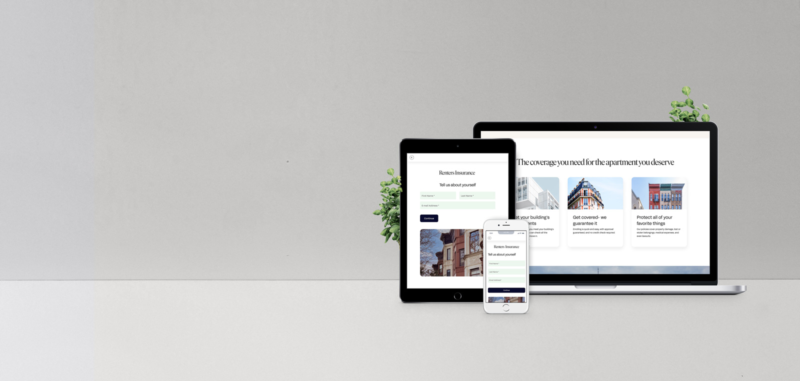
I redesigned the landing page to prioritize value-driven content over static data. By establishing a clear information hierarchy, I ensured that users immediately grasp the core benefits of Renters Insurance, significantly reducing cognitive load at the start of the funnel.
Qualitative feedback revealed that the previous design lacked the educational context necessary for first-time buyers. The updated interface bridges this gap with intuitive UX writing and visual cues that guide users through the insurance concept before they commit to the flow.