Features
Some of the core feature's the college needed was an easy navigation system between courses and other information, a detailed course description, a way to show graduate testimonials and let the students know about future events and news.
Menu System
The menu uses a primary blue color for the general elements and assigns different pastel colors for the different pathways.

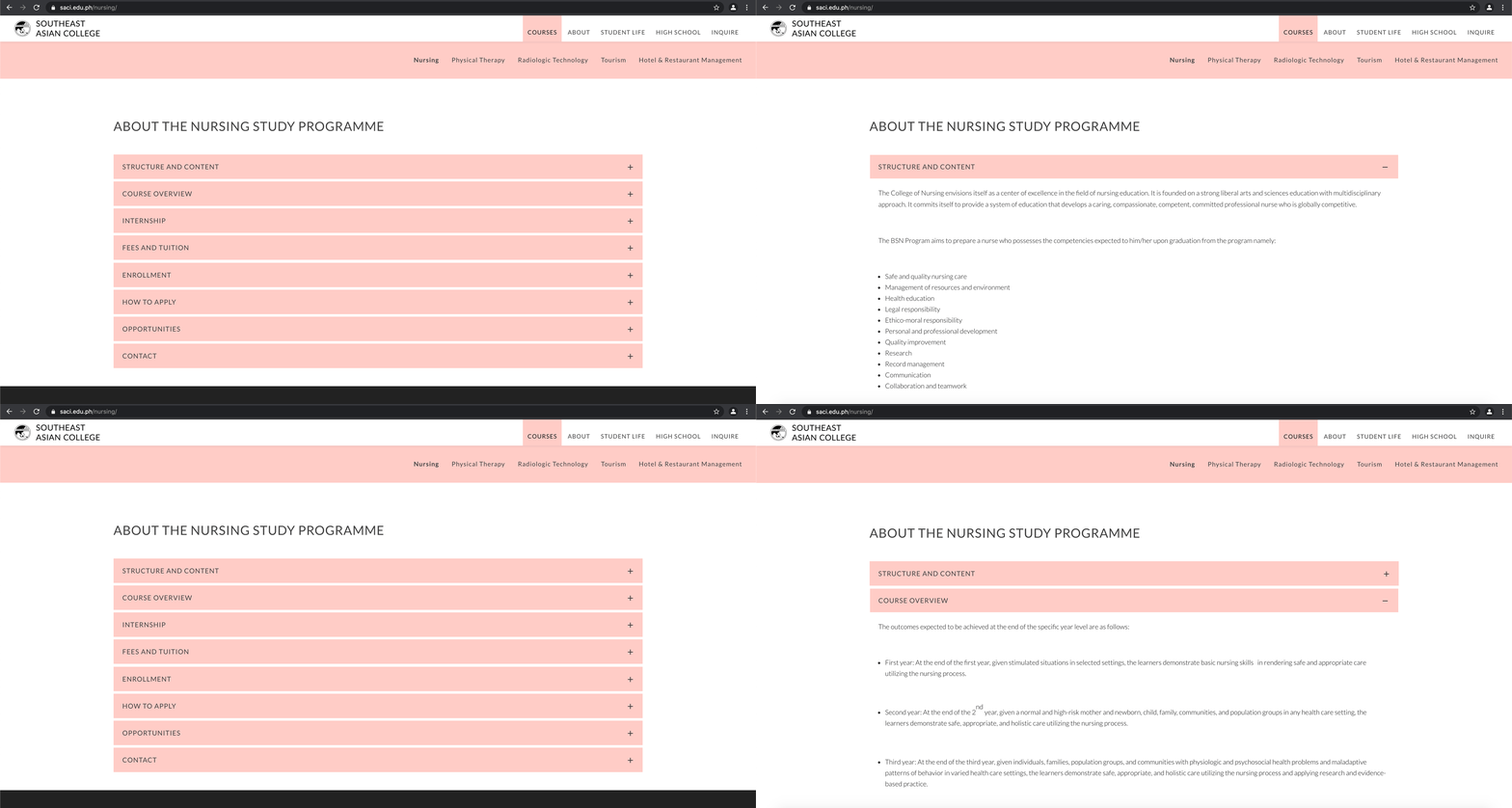
Course description
I wanted to create a transparent information system, where one can quickly find the information they need.

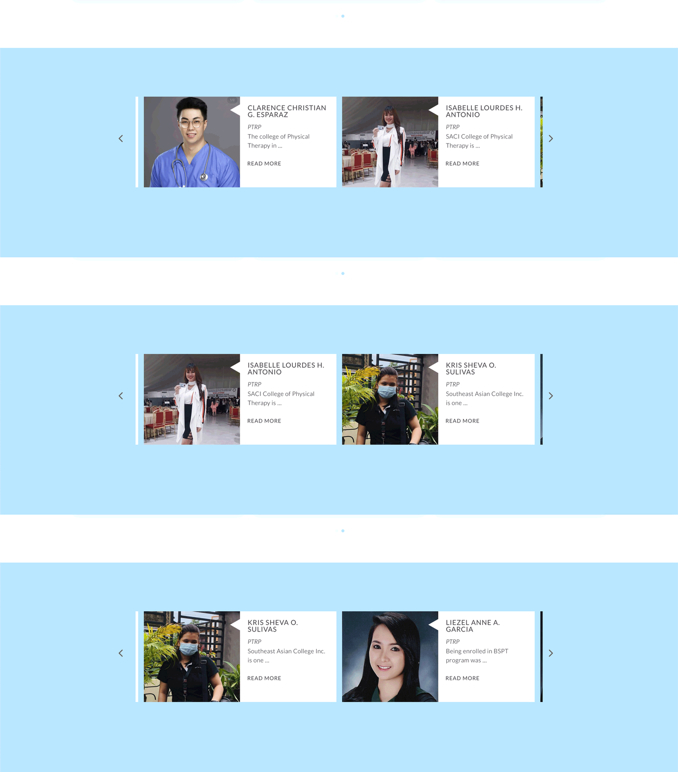
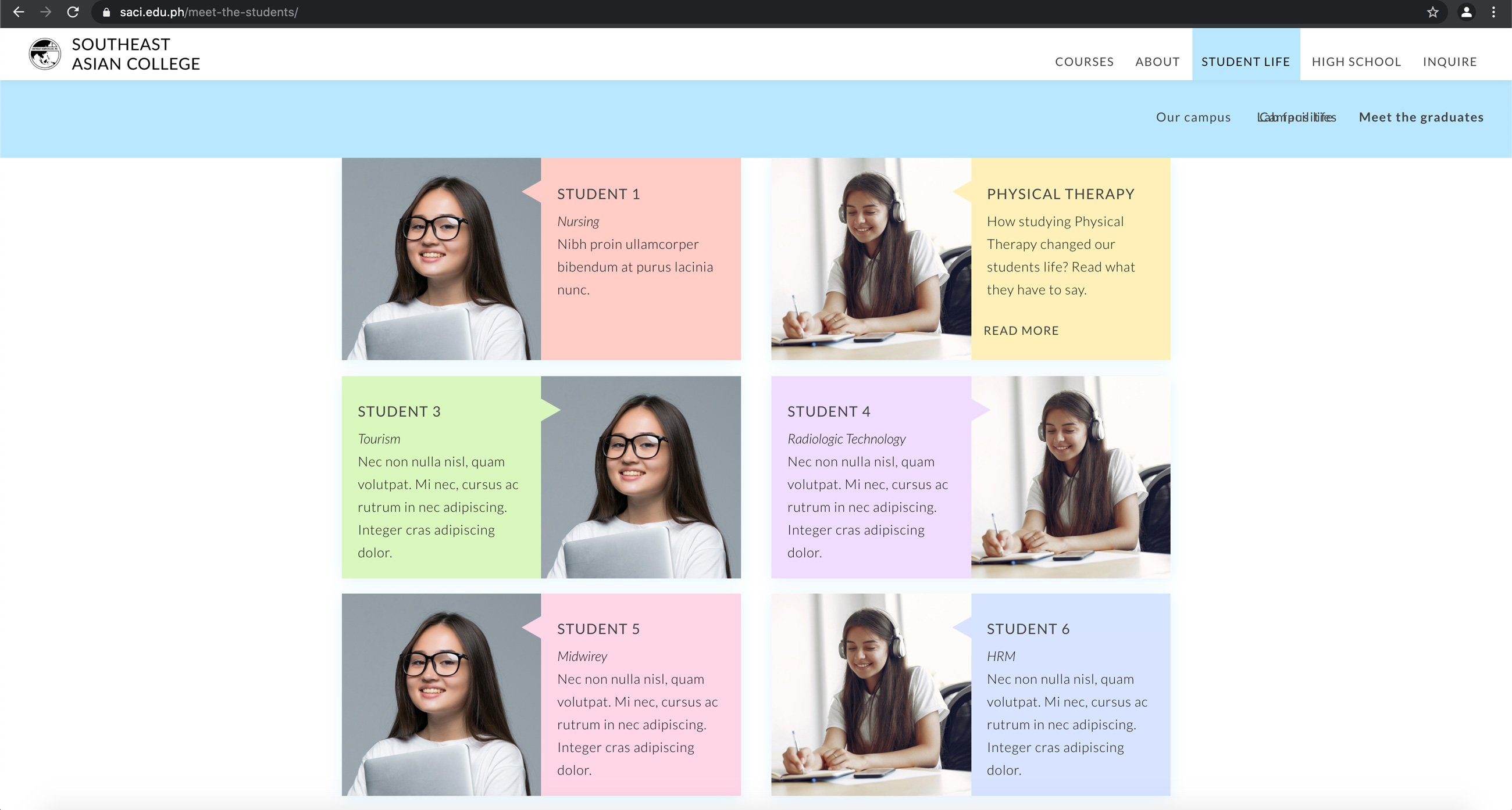
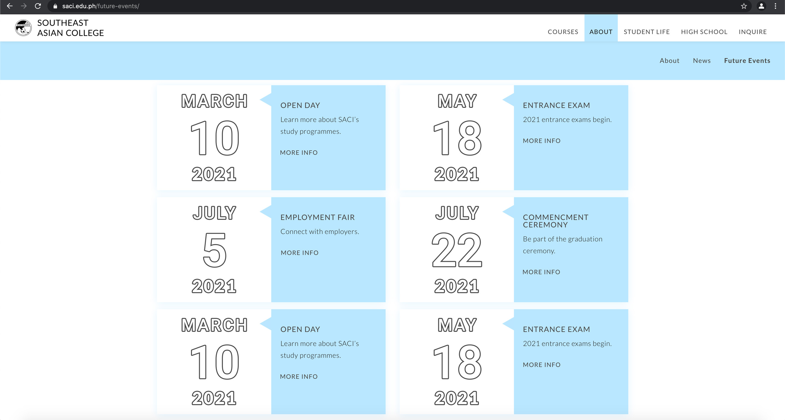
Student testimonials and events layout


Website overview
