Business Impact
Restored brand credibility and significantly reduced design-to-development handoff time.
Restored brand credibility and significantly reduced design-to-development handoff time.
TheGuarantors
Enhancing cross-product consistency to build brand authority and trust.
Figma
UX Lead, Design System Architect
I pioneered a centralized Figma Design System from the ground up to restore brand authority and resolve critical trust gaps identified in user feedback. This bespoke framework provided the scalable infrastructure necessary for an enterprise-wide migration to Material Design, significantly accelerating the design-to-development shipping cycle.
Visual fragmentation across three disparate products led to scam concerns in customer reviews, highlighting a failure in brand trust and visual authority. The lack of a solid UX/UI direction meant the design team was building in silos without a unified language.
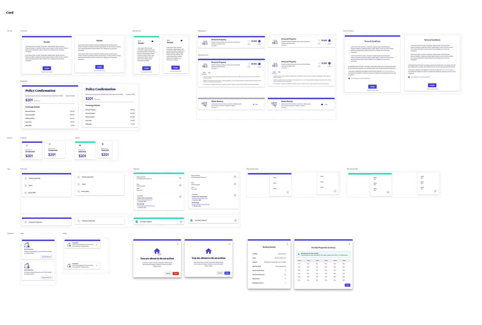
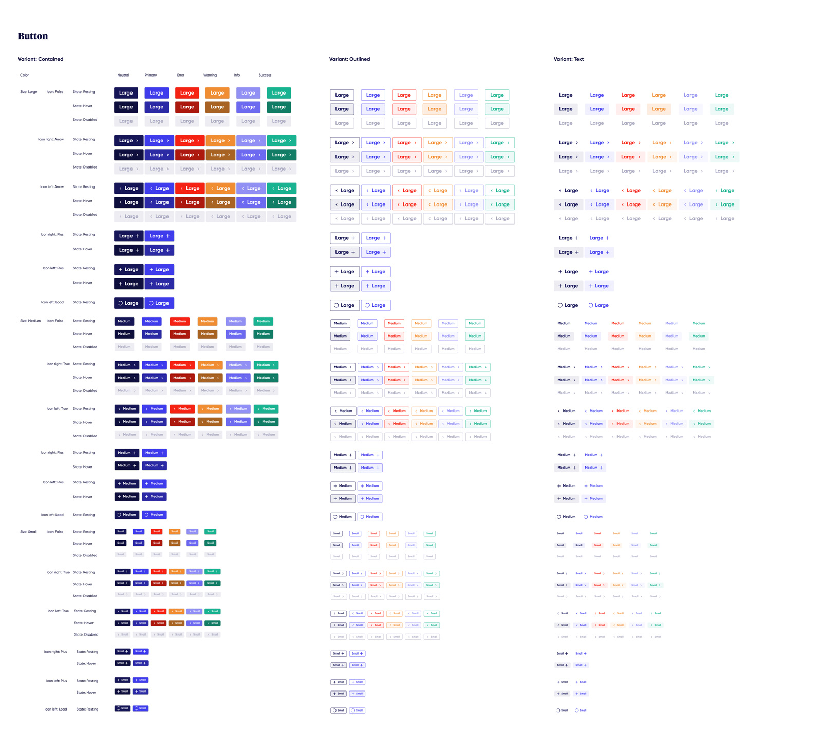
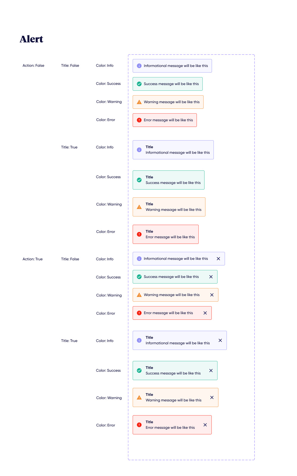
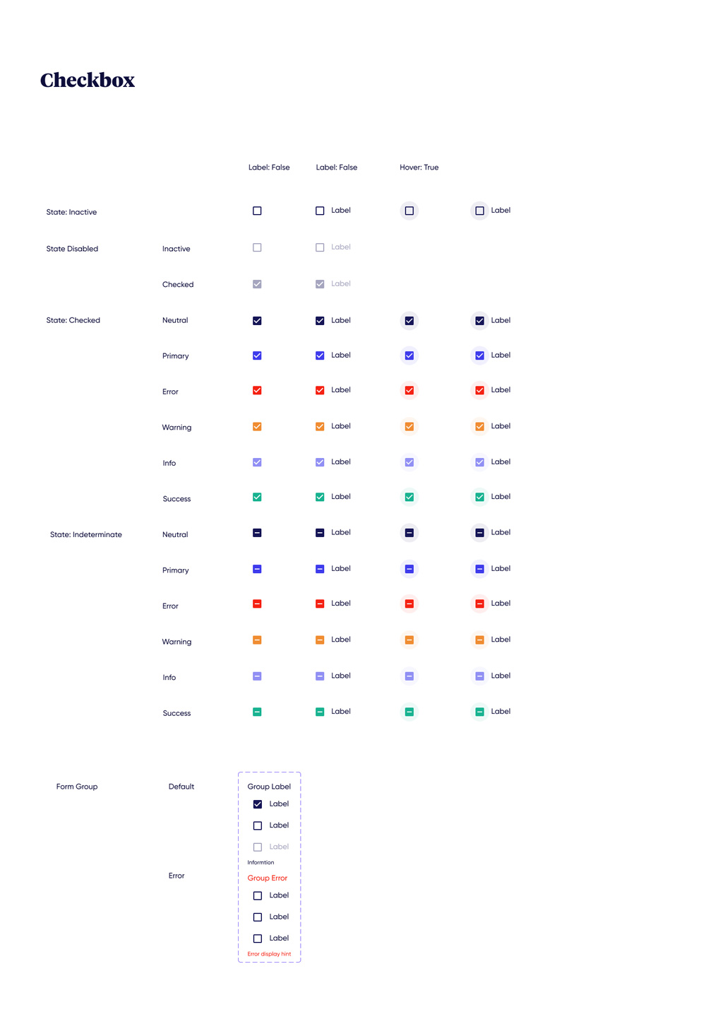
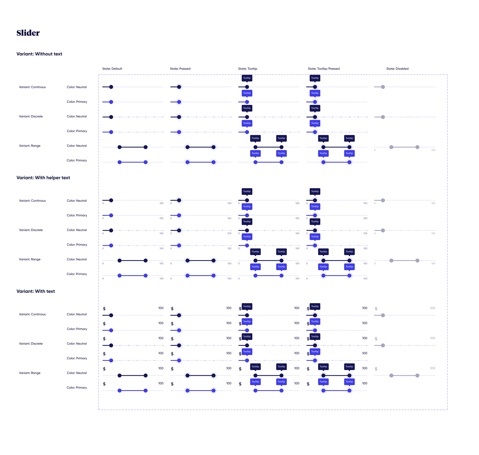
I pioneered the company’s first comprehensive Figma Design System to serve as a singular source of truth for all digital touchpoints. I engineered a bespoke library of components—from complex interaction states to accessibility-compliant forms—perfectly tailored to our specific technical constraints.
I led an audit of legacy patterns and architected a modular component library based on brand identity and target audience needs. I established a regular review cycle to ensure the kit remained aligned with evolving design standards.
I implemented a rigid typographic scale and expanded color palette to support complex interaction states while maintaining brand DNA. I established specific hierarchy rules to ensure the UI remained legible and professional across the entire suite.
I established a contribution model, allowing designers and developers to provide feedback on component behavior during the build phase. I led the discussion on initial ideas to ensure the system met the functional needs of the whole design team.
I documented usage guidelines for every component (hover, active, disabled states), facilitating a seamless enterprise-wide migration to Material Design. Building from scratch allowed for a deeper understanding of Figma's prototyping capabilities for future scalability.
Building a system from scratch, rather than using a pre-built kit, allowed us to solve prototyping problems on a deeper level. It reinforced the importance of documentation in maintaining long-term design consistency.
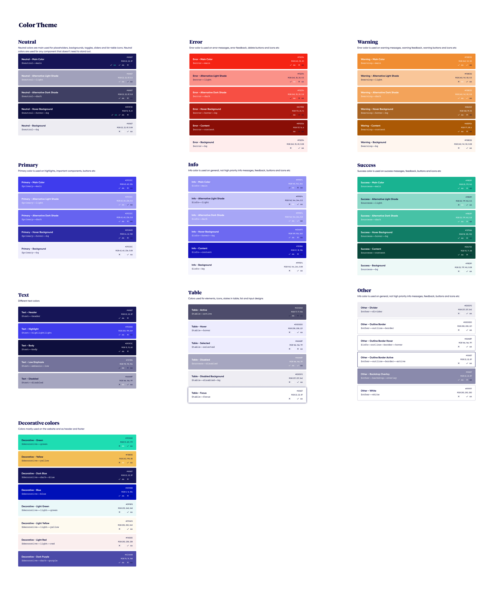
I expanded the color palette to support complex interaction states while maintaining brand DNA. I also implemented a rigid typographic scale to ensure information hierarchy and readability across the suite.
Furthermore, I made sure that all elements met WCAG 2.1 standards for readability.
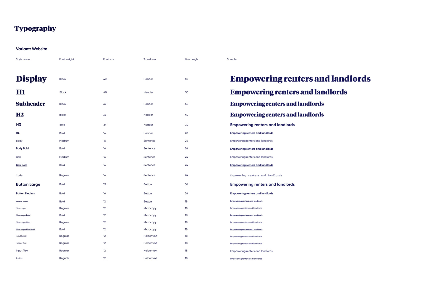
The legacy product suite suffered from inconsistent typographic application, which hindered information hierarchy and professional credibility. I architected a centralized typographic system based on a modular scale to ensure vertical rhythm and visual harmony.
By defining strict rules for heading levels (H1–H6), body copy, and micro-copy, I improved the overall readability of the insurance platform. Each style was documented with specific line-height, letter-spacing, and responsive behavior guidelines, allowing the development team to implement complex layouts with high precision.